User experience (UX) encompasses all aspects of the end user’s interaction with your company, including your services and products. It plays a critical role in influencing your overall customer experience and buying behavior.
Think of it as if you’re walking through a store. You’ve got a few items on your list and you want to get in and out fast. The store aisles are each labeled with numbers and a large sign that helps you quickly identify where you need to go. You’re able to get there quickly because the aisles are tidy and easy to navigate through. Employees throughout the store to ask if you need help finding anything and they greet you with a friendly hello and warm smile when you approach. You’re able to get everything you need on your list and even find a few additional items on sale. You go to the checkout and are again warmly greeted. You get all your items rung up, bagged, and paid for with ease. This is a good UX.
Similar to this traditional brick and mortar UX, when visiting your site your customers are having an experience. The experience they have should have is one that is easy to navigate, allows them to find what they are looking for, and quickly checkout.
Analyzing Your UX
How do you know if your website is providing your customers a good UX? A great visual design is just one piece of the puzzle to a great UX. There are many parts to UX and a good jumping point to start analyzing your UX is the User Experience Honeycomb made by Peter Morville.
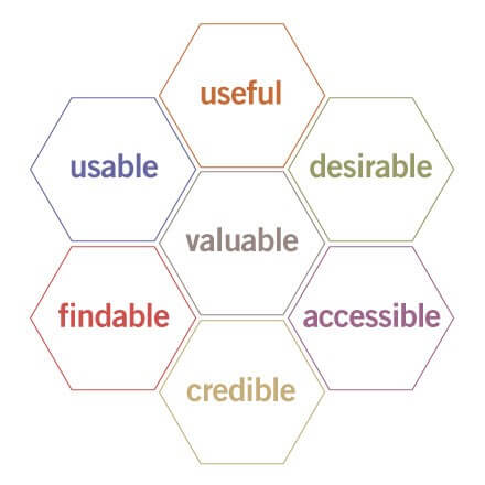
The honeycomb will help you analyze your site and find areas that you need to focus on improving and testing.
Here’s what it all means:
- Useful. Is your product or website useful in any way? The more useful, the better the experience.
- Usable. Ease of use. If it’s too complicated or confusing to use, you’ve already lost. Usability is necessary (but not sufficient by itself).
- Desirable. Our quest for efficiency must be tempered by an appreciation for the power and value of image, identity, brand, and other elements of emotional design.
- Findable. We must strive to design navigable web sites and locatable objects, so users can find what they need.
- Accessible. Just as our buildings have elevators and ramps, our web sites should be accessible to people with disabilities (more than 10% of the population). Today, it’s good business and the ethical thing to do. Eventually, it will likely become a legal requirement.
- Credible. Websites need to be credible – know the design elements that influence whether users trust and believe what we tell them.
- Valuable. Our sites must deliver value to our end-users. For non-profits, the user experience must advance the mission. With for-profits, your site’s UX must contribute to the bottom line and improve customer satisfaction.
While you measure your site against the UX Honeycomb you should also look into your site analytics using a tool like Google Analytics to identify pages that have high bounce rates and review your site goal funnels to determine the areas of your site that need improvement. So, what do you do next?
Test Your UX
Once you identify area/s of your site using your analytics and the UX Honeycomb the next step is to begin improving your UX. However, You should test them using a tool like Optimizely or Visual Website Optimizer (VWO) before making changes.
This will provide you with the data to let you know if your change is helping or hurting your conversion rates, without making any permanent changes that may negatively impact your conversions. It’s a great quick and nimble way to analyze and get to know your customers better without the larger overhead and risk of making permanent changes to your site can take.
We here at Classy Llama have launched many A/B test campaigns and while most saw improvements to conversion there have been tests that didn’t prove to be as successful.
First, let’s take a look at one of our tests that didn’t win on the Roger’s Sporting Goods product detail page. Upon first glance, the page has a lot of information and it is tightly squeezed together, making it hard to know where to focus your eyes. We decided to run a test that organized the product information with more spacing so that it is easier on the eye. We tested the product title more prominently in the upper left, increased the font sizes, give the add to cart section a different background to draw the user’s attention in and place the pricing information prominently next to the cart area.
The test ran for just over 2 weeks and we were surprised with the results. The control outperformed the test with the test version seeing a -9.2% drop in conversion.
The reason I want to share this losing test campaign is to demonstrate just how important testing your ideas is and what a big impact it can have on your sites conversion rates. Imagine if we just went out of the gate with our ideas and didn’t test, resulting in lost sales and revenue – not good.
Even if your test doesn’t end up improving your conversion rates it is still important because every test that you perform helps you get to know your customers better. A/B testing isn’t just about winning or losing, it’s about better understanding your customers.
[cta connected_to=”post” prefix=”Related:” count=”1″][/cta]
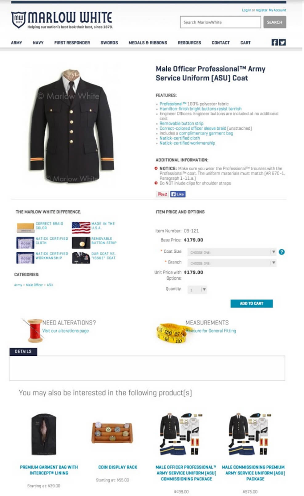
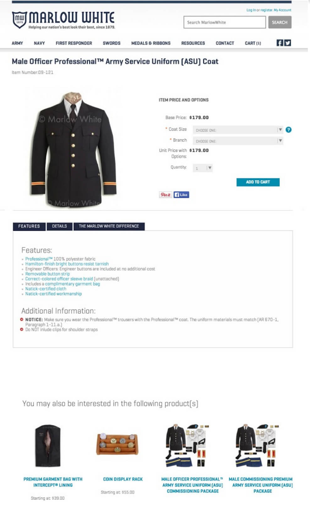
Now let’s take a look at a test we ran on another product detail page for Marlow White:
Upon analyzing this page we found that the add to cart options were pushed down to the middle of the page making it so customers had to scroll down the page in order to select and add the product to their cart. If you take a look at our test version you can see we moved the product title to the top of the page along with the item number. We increased the size of product image and to the right you can easily select your product options, view pricing and add to cart. Below this you’ll find all the details and features in a simple tabbed content area.
In this case, our hypothesis that moving the product options, pricing and add to cart button up on the page would increase conversions proved to be true. This test outperformed the control by 2%.
You can easily see now how important testing your ideas is and how you can gain some great insight and data on the impact your changes make. Even the slightest change can result in a large improvement.
The Numbers Game & Guidelines for Testing your UX
When running a test it is also important to allow your test to run for a long enough period of time to reach statistical significance. Tools like Optimizely will gather the data and tell you when your test has reached statistical significance and declare a winner. There are also some easy to use statistical significance calculators to help you determine on your own.
Another good rule of thumb, in addition to not calling the A/B test done too early, is allowing the variations to reach about 350-400 conversions each. While this number isn’t the magic number it’s a good guideline. You can also use a test sample size calculator so you can get a number that is better aligned for your site’s traffic and current conversion rates.
In Conclusion
Good UX and conversion rates are closely related, and you can’t have one without the other. With every element you test you’re going to learn more about your customers. Even if you don’t have a winning test it is important to remember you are still learning what your customers do (or don’t) want.
Good UX = Good Customer Experience = Conversions.